navAble
Clearing the path for accessible navigation


NavAble was part of a 4-week project for a Value Sensitive Design class where I was tasked with applying VSD principles to create a product that aligns with stakeholder values and ethical design considerations. As the sole designer, I led the end-to-end design process, conducting stakeholder analysis, defining key values, and integrating ethical frameworks into our solution.
Unexpected barriers like sudden sidewalk closures, broken curb ramps, or construction detours can turn a simple trip into a frustrating challenge for mobility-restricted individuals. Existing navigation apps don’t account for these real-time obstacles, leaving users without safe or accessible routes, resulting in increased stress, longer commutes, and decreased access to essential spaces.
Navable crowdsources real-time accessibility data to provide up-to-date information on sidewalk closures, poor curb ramps, construction detours, and other obstacles that existing navigation apps overlook.
Skip the guesswork with pathways tailored to your mobility needs.

See real-time obstacles like blocked sidewalks, neglected sidewalks, steep inclines, and construction zones before they slow you down.

Report obstacles in seconds to keep routes clear and the community moving safely
.gif)
Use augmented reality to scan your surroundings and visualize potential barriers, making navigation more intuitive and safe for visually restricted individuals.
.gif)
Our investigation identified key stakeholders facing mobility challenges—people with disabilities, the elderly, city planners, caregivers, and advocacy groups. Their shared priorities include accessibility, safety, and inclusivity in designing better solutions.

To validate our stakeholder insights, we conducted a survey using convenience sampling. Over 2 weeks, we gathered 18 responses, helping us better understand real-world mobility challenges.
INSIGHTS
78% has or have had their mobility-restricted
95% often or sometimes encounter accessibility obstacles
100% said obstacles significantly slow them down
68% said they had to change their route due to accessibility obstacles
83% are concerned with the lack of live updates in existing navigation apps
100% think crowd sourced data would be useful in a navigation app
I conducted a competitive analysis on 4 different navigation apps to gain a deeper understanding of their accessibility features, usability, and how they address mobility challenges. These apps lack real-time obstacle reporting, community-driven data, and tailored accessibility options for users with mobility restrictions.

After conducting the competitor analyses, I found many interesting insights for our three users groups: mobility-restricted individuals, the elderly, and individuals with non-visible disabilities.

To visualize how users interact with our solution, I created a storyboard illustrating Joni’s experience navigating the city. This storyboard helped us map out pain points in real-world navigation and refine features.

"How might we support mobility-restricted individuals, the elderly, and those with non-visible disabilities in navigating unprecedented challenges in their daily commutes around the U-District?"
With our problem statement in mind, I defined 3 key design requirements to support users navigating accessibility barriers in real-time. These requirements ensure the app is intuitive, informative, and actionable.
I kicked things off with quick sketches to explore how users could report obstacles, find accessible routes, and get real-time updates. Doodling out different ideas helped me visualize the experience and figure out what felt the most intuitive. These early sketches laid the foundation for a design that puts accessibility and ease of use first.

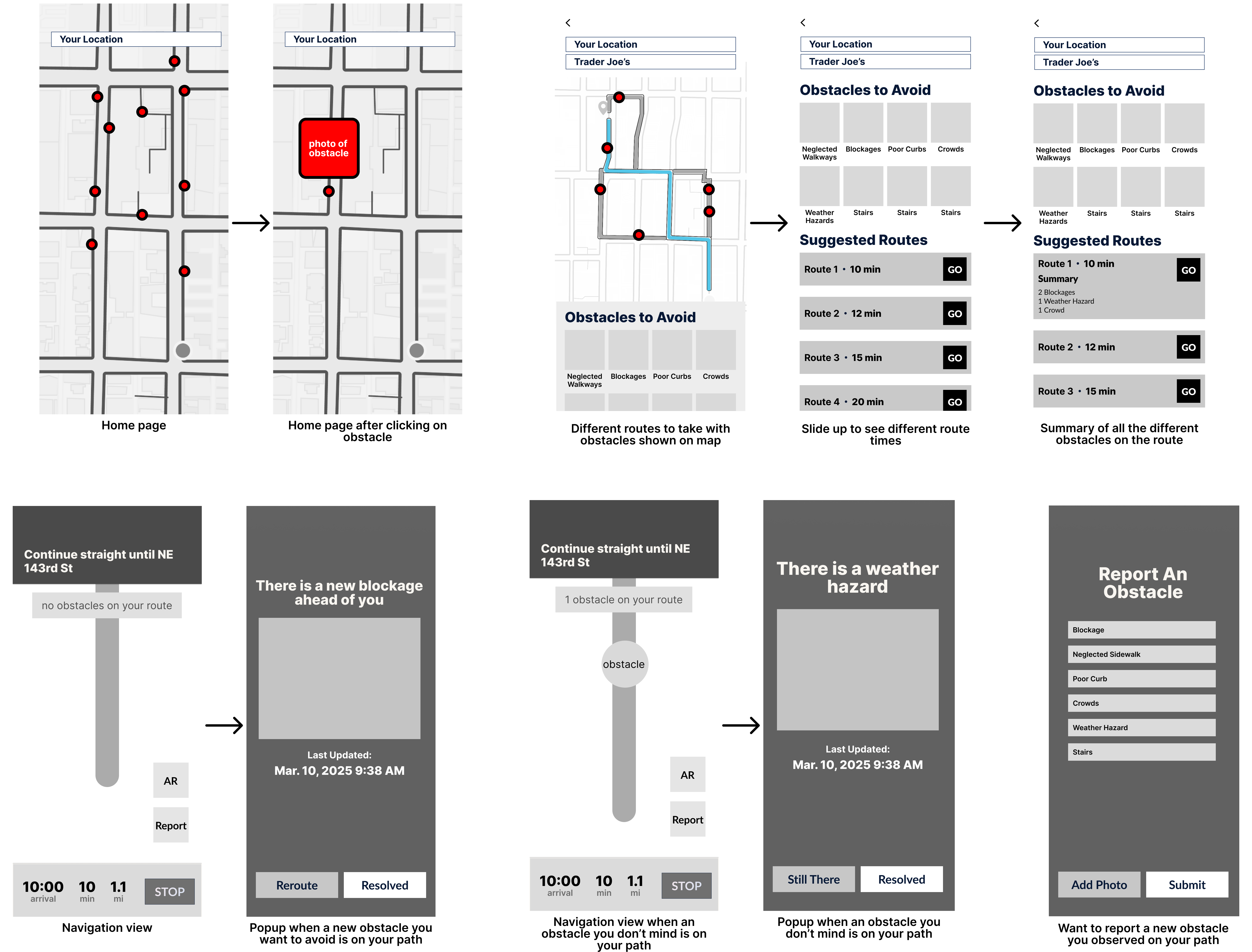
After those quick sketches, I brought them into Figma to create mid-fidelity wireframes, helping me focus on layout, navigation, and core interactions without getting caught up in visuals too soon.

From our wireframe, we created 4 main user flows to use for usability testing with 3 participants. These flows represent core functions of our platform: reporting obstacles, personalize your route, and live obstacle updates.


To make the app feel intuitive and easy to navigate, I built a design system that keeps everything consistent. From colors to typography to reusable components, every element was designed to make interactions seamless.
The color palette balances contrast and clarity to enhance accessibility. A dark plum conveys reliability, a midnight blue reinforces trust, a misty blue offers a calming touch, and a blushy pink adds approachability.

Since accessibility was a key consideration and value, I followed WCAG (Web Content Accessibility Guidelines) and APCA (Accessible Perceptual Contrast Algorithm) to ensure color contrast and enhance text clarity for all users. WCAG provides guidelines for accessible digital experiences, while APCA offers a more accurate contrast measurement for better legibility.

With the foundation set, I transformed the mid-fidelity wireframes into polished high-fidelity designs. These final screens show exactly how users will interact with the app, from reporting obstacles to finding the best routes.

This project reinforced the importance of Value-Sensitive Design—ensuring that every decision was grounded in the needs and values of both direct and indirect stakeholders. Accessibility, safety, and independence were at the core for those navigating mobility challenges, while city planners, caregivers, and advocacy groups valued efficiency, accountability, and equity. By considering these perspectives from the start, we weren’t just solving a navigation problem—we were building a tool that fostered a more inclusive and supportive environment. This process reminded me that good design isn’t just about functionality; it’s about creating solutions that reflect and respect the values of the people who rely on them.